
Reflection Video & Media LLC. - Corporate Identity
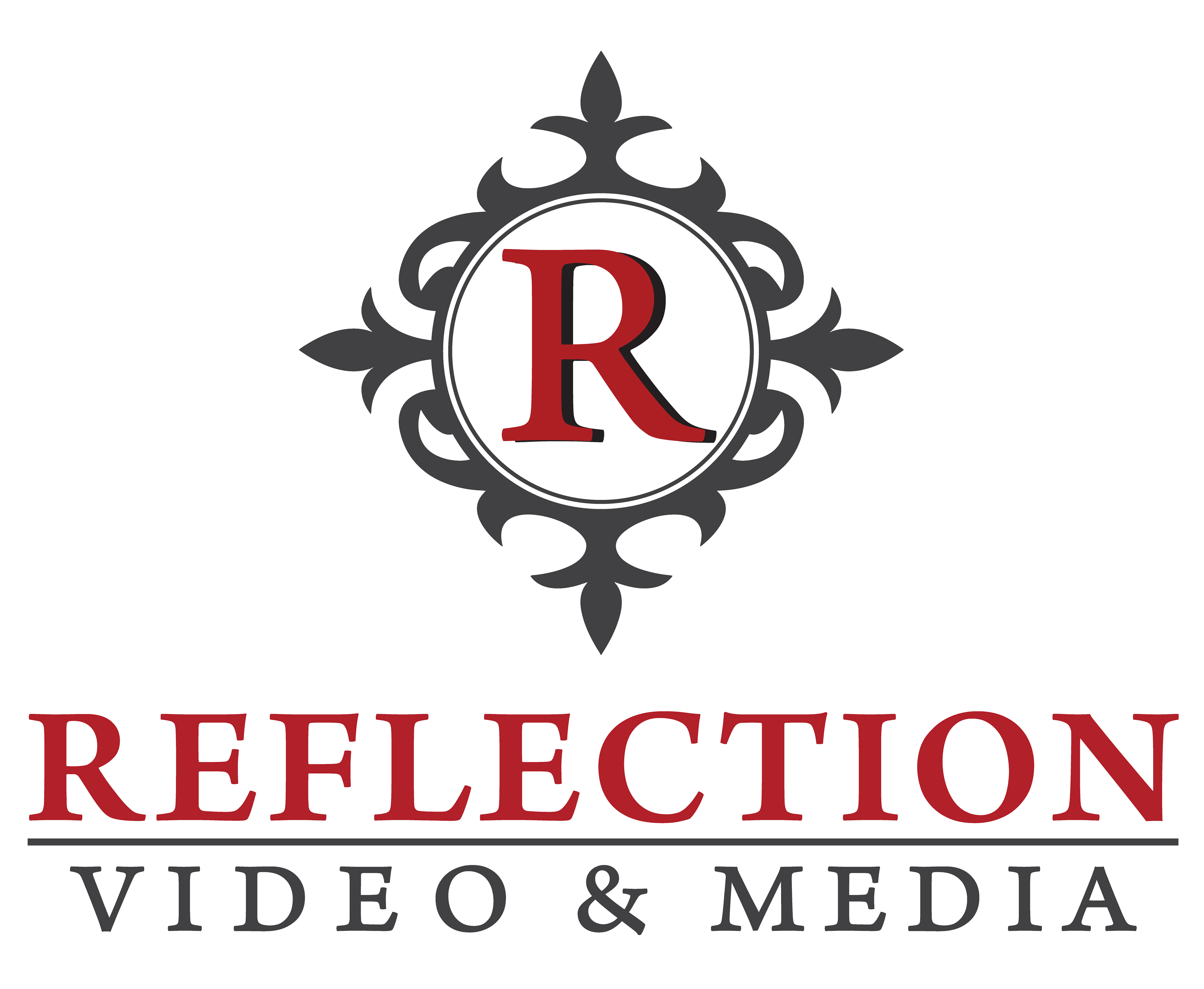
The new logo I have created is clearer and more concise than the original; while retaining a recognizable look for returning customers. The "R" is encapsulated in a circle with a white background. I blended the borders of the circle into the filigree shape to create flow. I updated the design to be cleaner, more printable and memorable with greater contrast for ads and other applications.
Red is retained as part of the overall design as an attention getter as well as the significance that red communicates to the customer. Red Represents Energy, action, passion, and love. Additional red draws focus to the name “Reflection.” A darker charcoal gray has been added to the filigree shape for greater contrast and clarity for diverse printing applications.
The shapes & patterns used in the overall design are of Filigree; an ancient art form using precious metals twisted into lacy decorative patterns.
Having this vintage style for your corporate identity gives a sense of nostalgia and handcrafted artistry of precious memories captured in personalized, timeless films.
The font used for the Logo is a Serif font from Adobe called Arno Pro. It is meticulously crafted with the warmth and readability of early Venetian book types of the 15th century. While inspired by the past, it is distinctly contemporary in both appearance and function, thus fitting of your vintage, yet contemporary design.
Contrast: The darker charcoal gray filigree shape creates contrast against the background and the inner circle of the logo where the "R" in red with a black drop shadow adds more contrast.
Repetition: The shape of the filigree design has a symmetrical shape that is repeated in itself as well as its use through all the other designs. The colors in the logo are also repeated in the wordmark with the same red in the "R" with "Reflection" and the same grey of the shape as part of "Video & Media" and the black line between the lines is the same as the black drop shadow of the "R" in the logo.
Alignment: I tried to make everything as centered as possible, I adjusted the kerning between letters to make the words centered with the logo and with each other.
Proximity: I made sure there was a comfortable amount of space between the lines as well as the filigree shape.
Hierarchy: I placed the logo above the wordmark like a crest and the font spans out further than the logo emphasizing the name of the company in Red.
Flow: I blended the borders of the circle in the logo into the filigree shape to create flow.
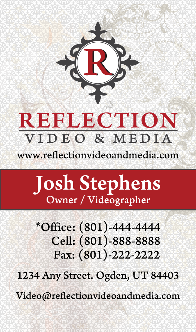
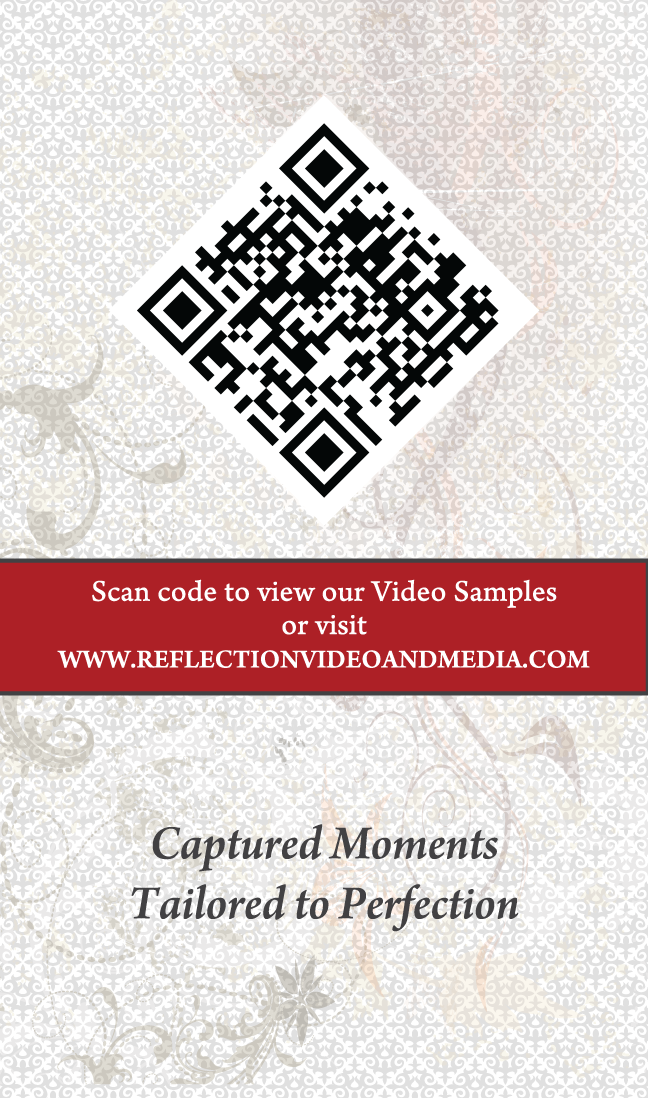
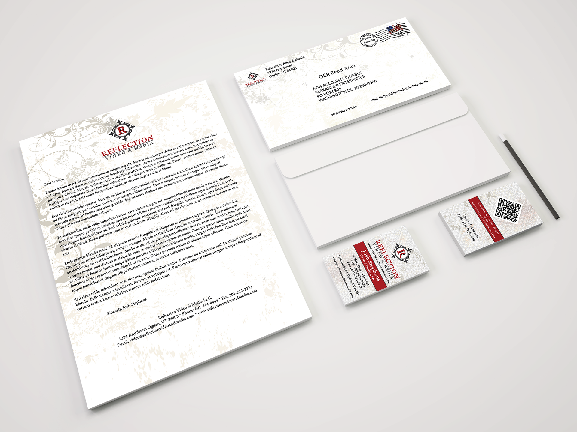
The business card for Reflection Video and Media is portrait oriented. The logo fits the card better this way and it helps give the card a unique look, as to stand out from the rest. All the important information is included along with a tagline on the back. I created the business card with two layers of background graphics with a filigree motif in a diamond shape.
I also included vines to add depth and dimension as well as creatively integrating the QR code into the diamond-shaped motif. The QR code, when scanned by a smartphone, takes the customer to your video samples, making your whole video portfolio, as easy to access as handing them a business card.
Contrast: The colors used in the logo and the rest of the lettering create contrast against the background.
Repetition: The same colors used in the logo are repeated throughout the design of the card in the text and text boxes. The filigree shape from the logo is repeated in the background as a motif.
Alignment: Everything is aligned to the center consistently throughout the design of the card.
Proximity: I tried to keep different pieces of information an even spacing from each other, with related information together.
Hierarchy: Emphasis is given to the owner’s name and title with white font on red backing and slightly larger than other fonts on the card. The logo is also emphasized with its size and high position. Instead of trying to bury the QR code and hide it in the design, the QR code on the back of the card is given emphasis with its size and sideways position as well as how it fits into the diamond shaped motif in the background.
Flow: the centered content flows down the hard and the vine design curves around the corners of the card adding flow.
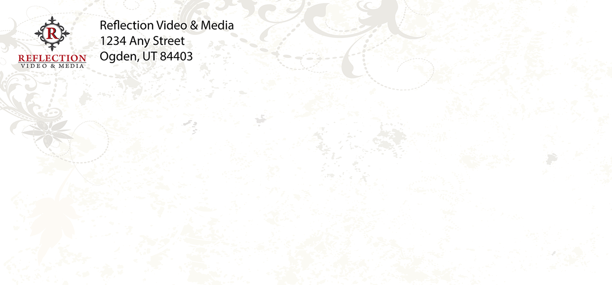
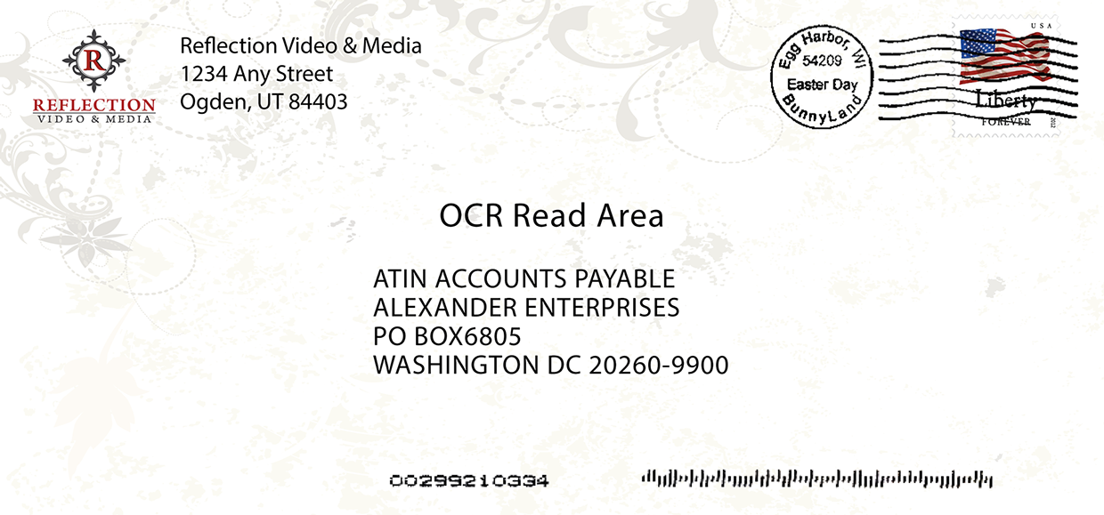
When creating the design for the envelope, I took into consideration the need to keep areas for required information clear of obstruction for things such as the barcode, stamp, and address, while still having a creative design that spans the range of the whole envelope. That is why I chose to only use the vines and leave out the filigree motif layer.
Contrast: The vine design resembles the curls of the filigree pattern and creates contrast in the top left corner of the envelope as well as the logo that is placed there as well.
Repetition: The same vines are used in other pieces of the brand and flow throughout the design with the same colors.
Alignment: the vines are only in the top left corner as to keep the other corners mostly free of obstruction.
Proximity: The design and the address label are properly placed to give room for the required information for postage.
Hierarchy: The vine design surrounds the corner, giving more emphasis to the company name & logo on the envelope.
Flow: the vines flow around the logo and point toward the information on the envelope.
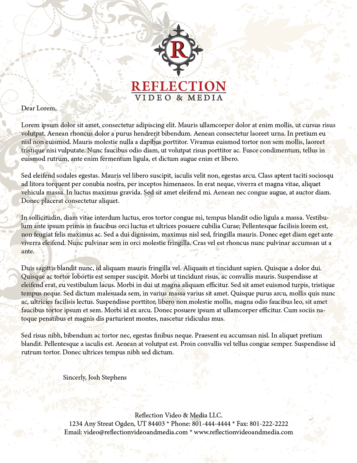
Similar to the envelope, when I made the letterhead, I left out the filigree motif layer to make sure it would not be difficult to read a large body of text on the page. The design is still cohesive but makes for a clearer area to write on, while still making the letterhead design creative, and the brand recognizable.
Contrast: Similar to the envelope, the vine design creates contrast in the top left corner with the logo in front of it.
Repetition: The same vines resemble the filigree and flow throughout the design with the same colors.
Alignment: The vines are only in the top left corner as to keep the rest of the page mostly free of obstruction for writing.
Proximity: The design, logo, and contact information are centered and are properly placed to give room for writing.
Hierarchy: The emphasis is given to the company name & logo as it is placed at the top center of the page.
Flow: The vines create flow and lead the eye toward the logo. The rest of the vines come down the left side of the page to draw the eye toward the next line that will fill the page.
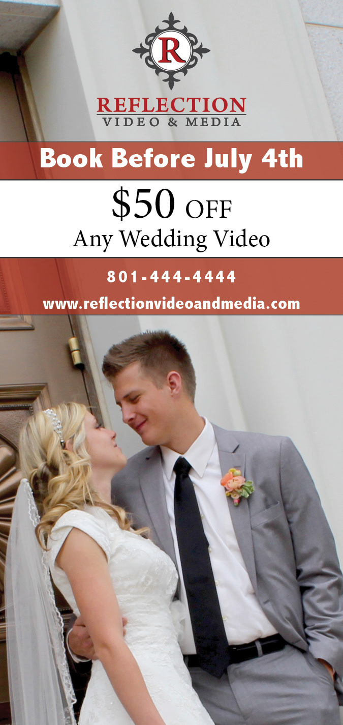
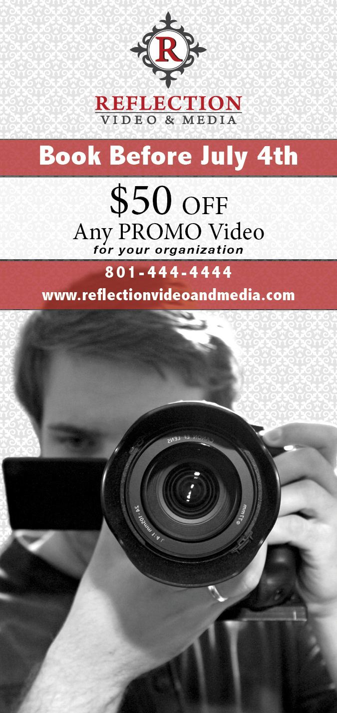
The Magazine ads feature a $50 promotion for videos for your two demographics. The One for your primary demographic of brides could be placed in magazines such as "Utah Bride & Groom," and "Utah Valley Bride Magazine." The ad for your second demographic of Business Owners could be placed in the Utah Business Magazine and BussinessQMagazine.
Contrast: The red boxes with black borders create contrast along with black font on white and white font on red pop out. The image color contrast was raised to give a cleaner look.
Repetition: The same colors in the logo and corporate design are used in the ads as well, the background filigree motif matches the logo filigree and shows as a repetitive pattern.
Alignment: The logo and text are center aligned. The photo being a little off center to make it more interesting, the background pattern is aligned in a diamond pattern.
Proximity: Related information is grouped together and separated with text boxes. Lettering has enough lighter space between to make it easy to read.
Hierarchy: Emphasis is given to the promotion of $50 off with it being large.The information is centered and emphasized more with white text on red and black text on white.
Flow: the information cascades down the page and flows from one piece of information to the next
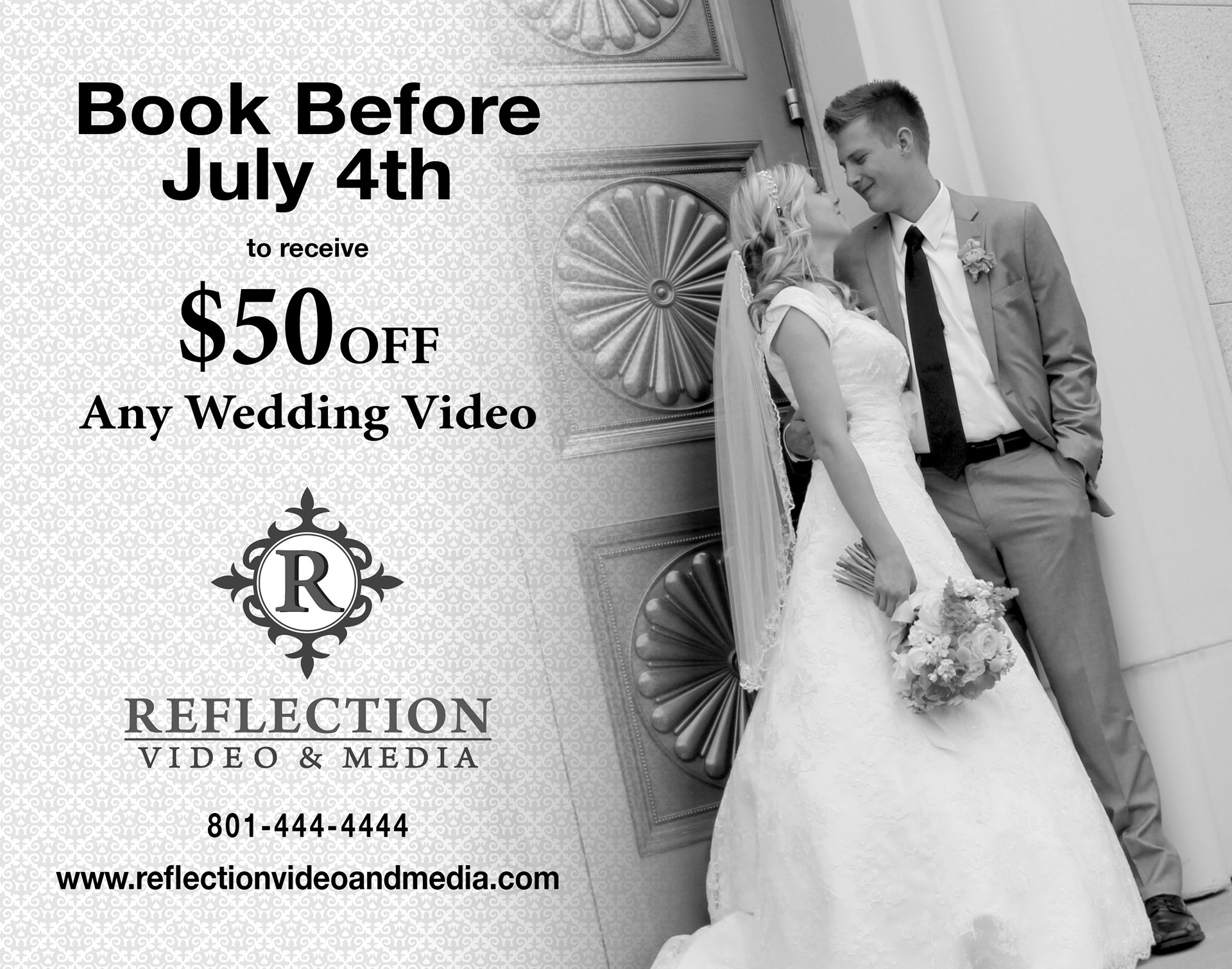
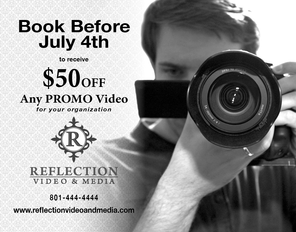
The newspaper ads use the same elements as the magazine ads, Using the same images with less cropping gives a better view of your work and still looks great in grayscale. Because most of your customers are near Salt Lake and Provo, the ads for both demographics could be put it in the Salt lake Tribune, Daily Herald, and The Deseret News.
Contrast: Although the newspaper ads are in grayscale the deep black text contrasts against a light gray background and the black of the camera stands out. White inside the circle contrasts the charcoal gray "R" in the logo. The contrast was raised in the photo to create a cleaner look.
Repetition: The same colors in the logo and corporate design are used in the ads, except in greyscale. The background filigree motif matches the logo filigree and shows as a repetitive pattern.
Alignment: The logo and text are center aligned. The photo being a little off center to make it more interesting, the background pattern is aligned in a diamond pattern.
Proximity: Related information is grouped together and separated with text boxes. Lettering has enough lighter space between to make it easy to read.
Hierarchy: Emphasis is given to the promotion of $50 off with it being large.The information is centered and emphasized more with black and gray text on white or light gray.
Flow: the background motif fades into the image next to the information making the design flow together as one piece rather than two separate compositions.